Posts categorized: Installation

Installation, Projects /

Penta Retreat For Sensory Rehab

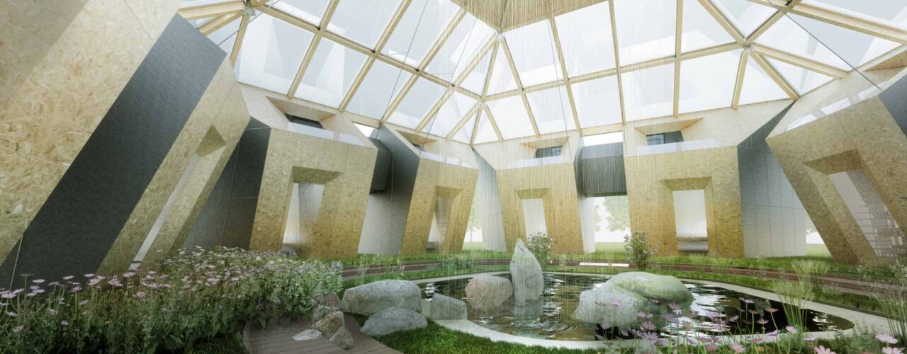
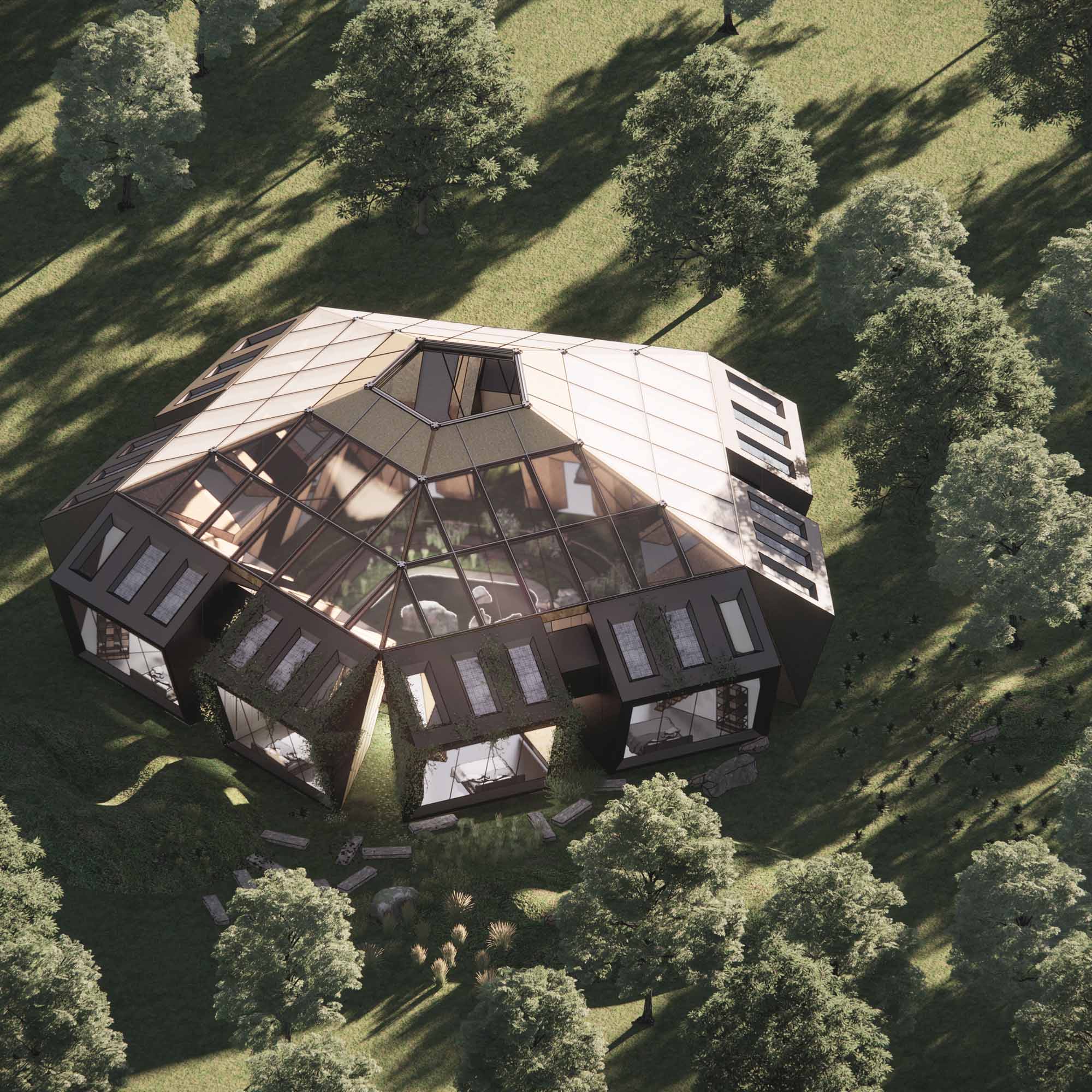
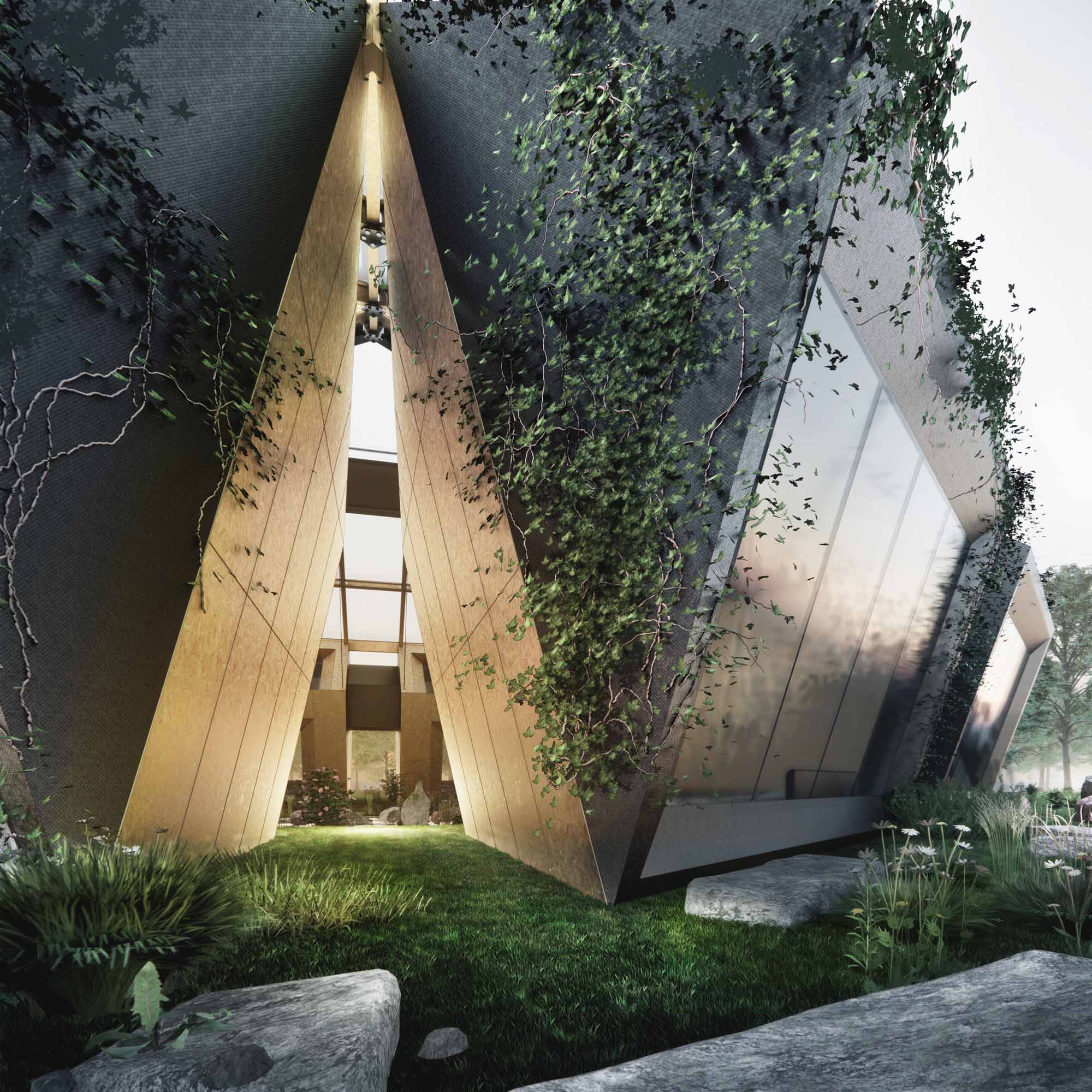
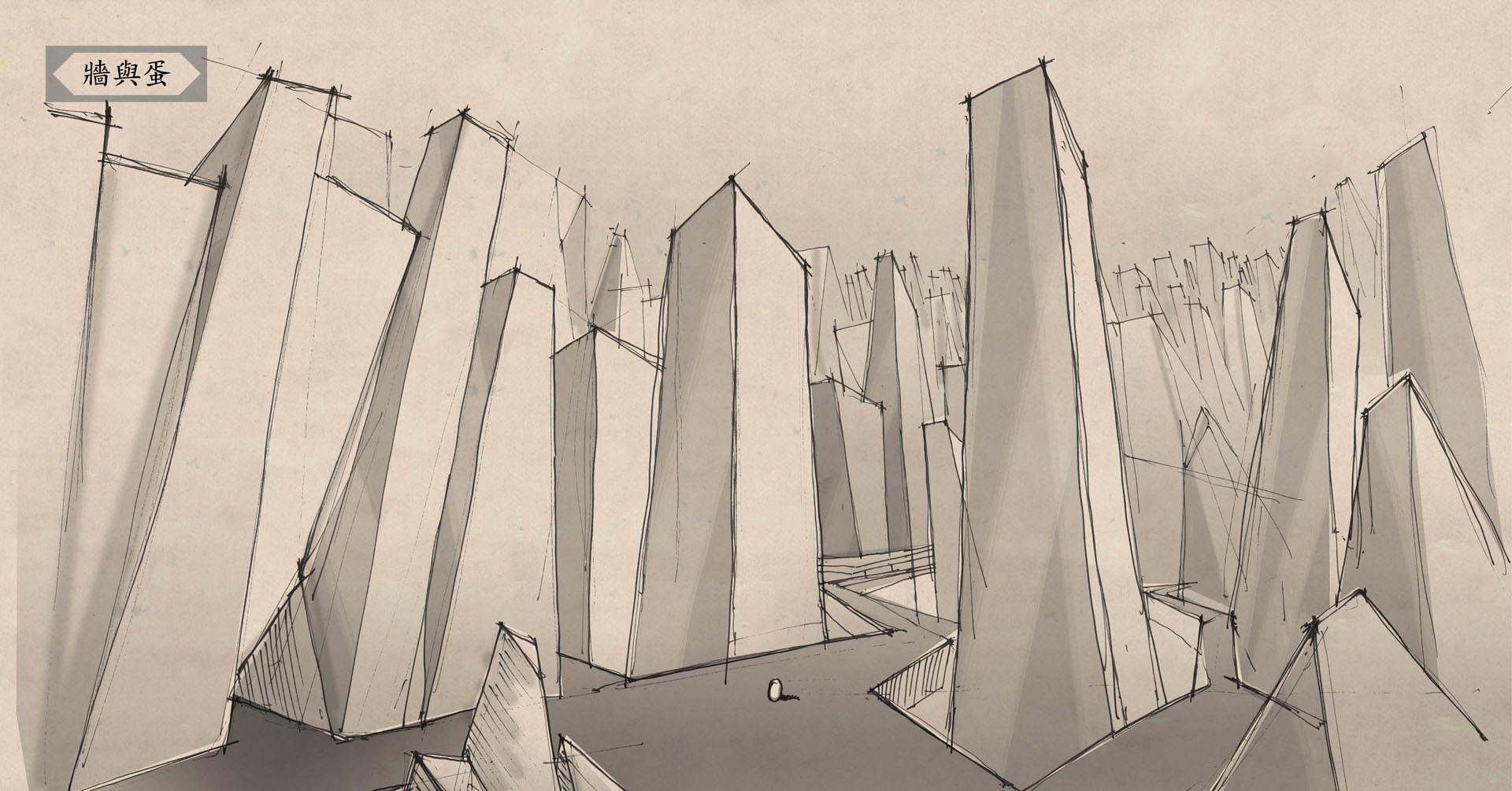
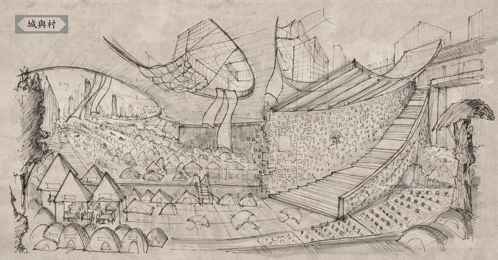
Our proposal addresses a conceptual retreat for ten people in an urban setting. During the 2020 pandemic, loss of smell or taste were common among recovered patients and not everyone can afford to travel to the countryside for a getaway. Penta Retreat situated in the heart of London is made for people to rejuvenate their senses and minds. The pentagon looks out to the city with five distinctive simulations – sound of nature, smell of plants, taste of herbs, view of the cityscape and touch of raw materials. The ten units are formed around a semi-opened sensory garden that allows for a different microclimate and ecosystem. Occupants can enjoy various sensations throughout their stay. The choice to set up a countryside-like retreat in the urban center is to make sure the retreat is made inclusive and accessible to everyone from different income and physical conditions. With off-the-grid design, every city should be able to find spaces for people to getaway.

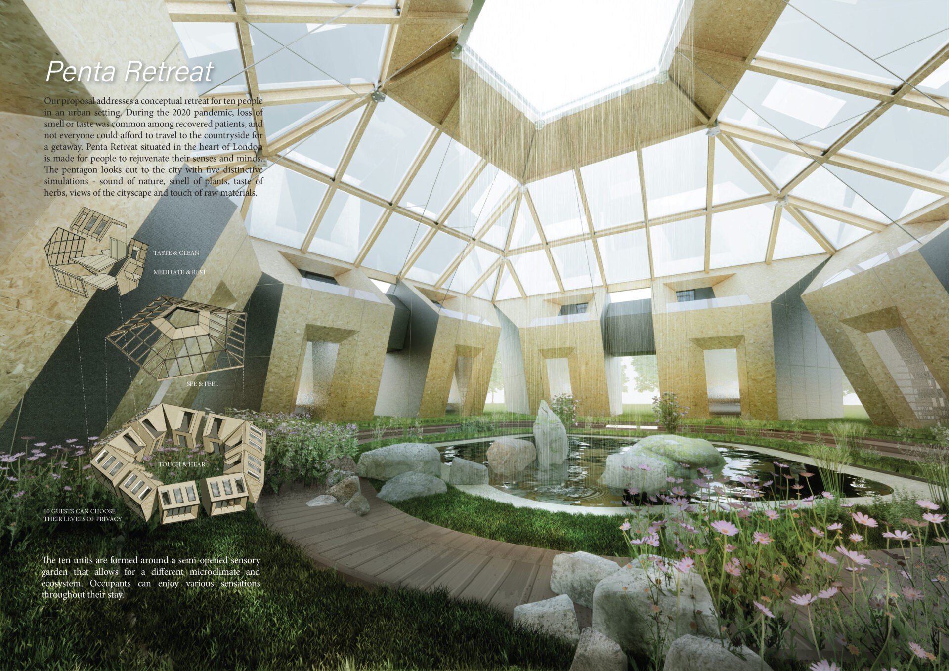
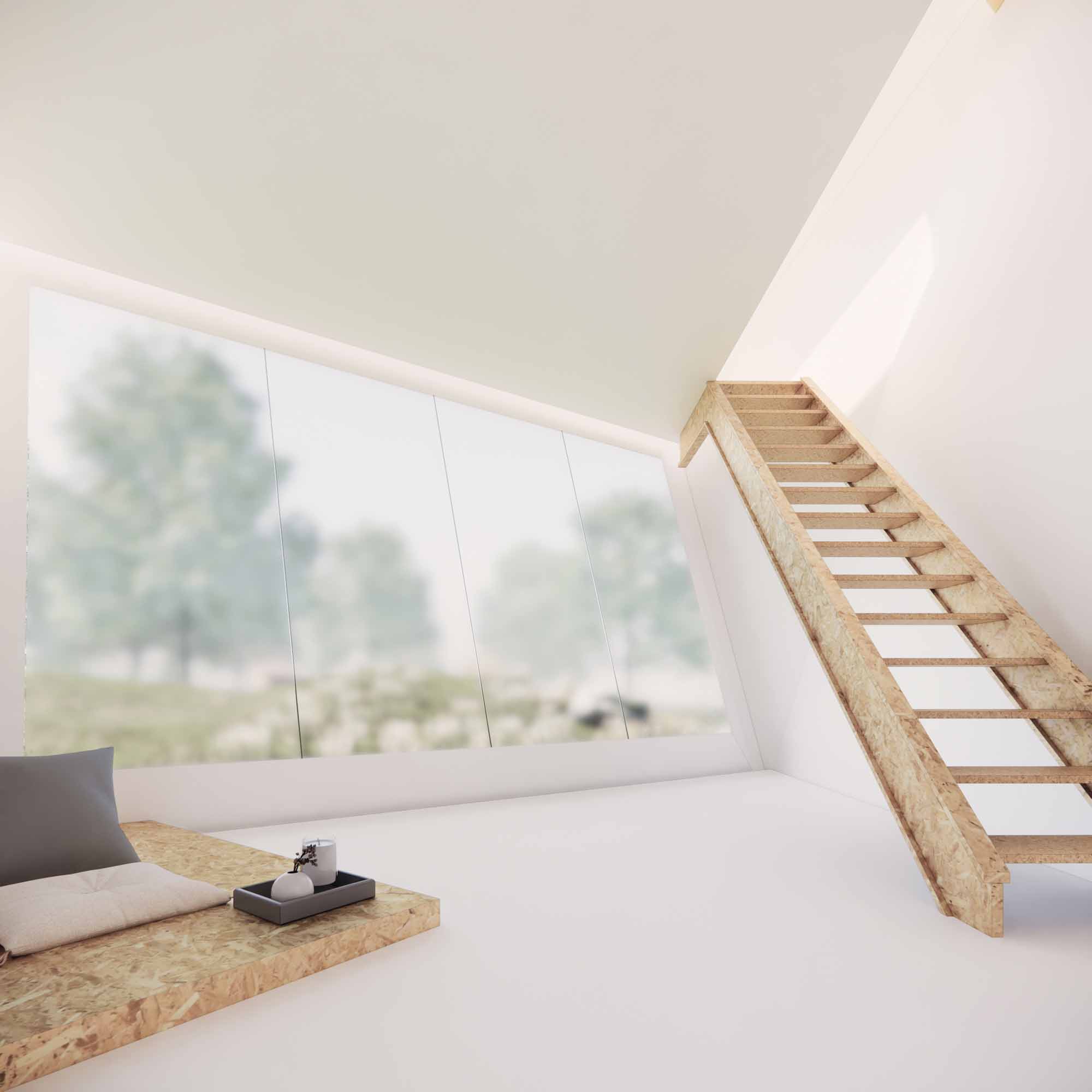
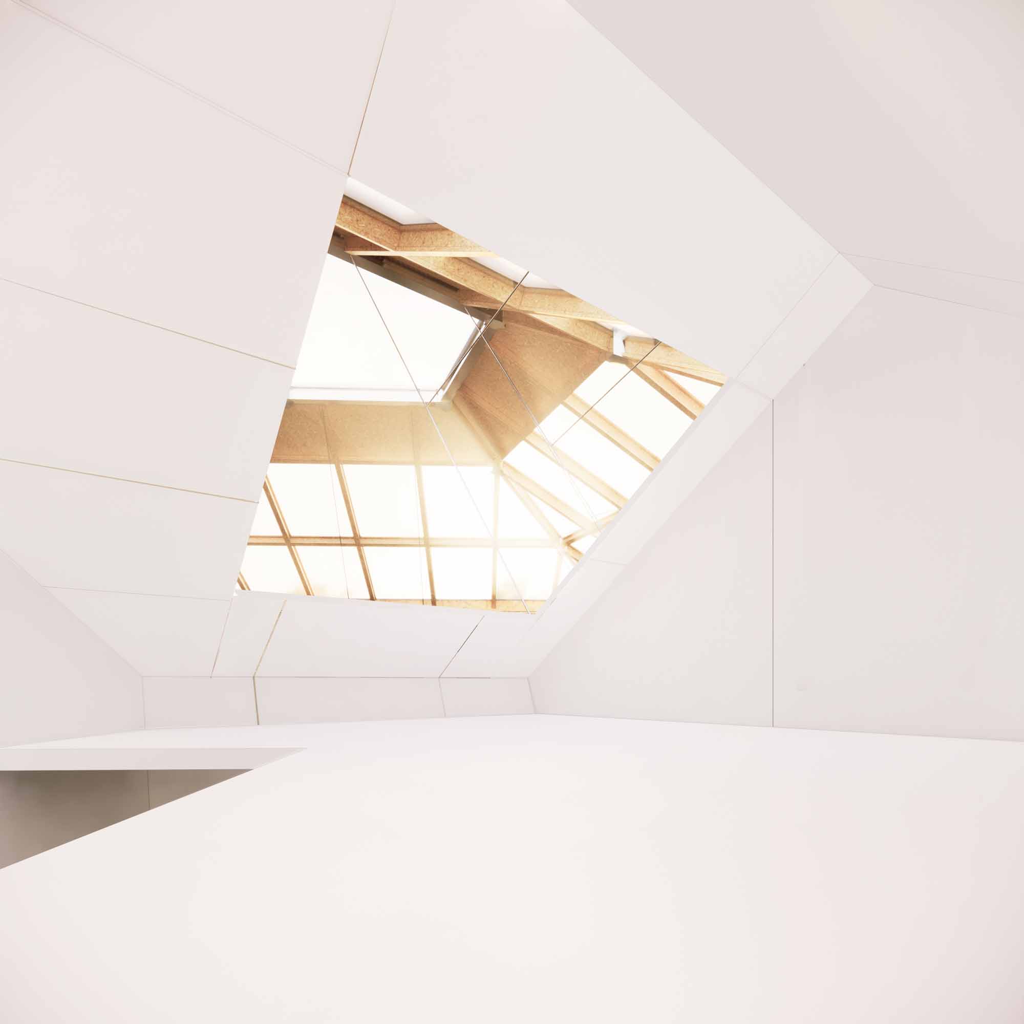
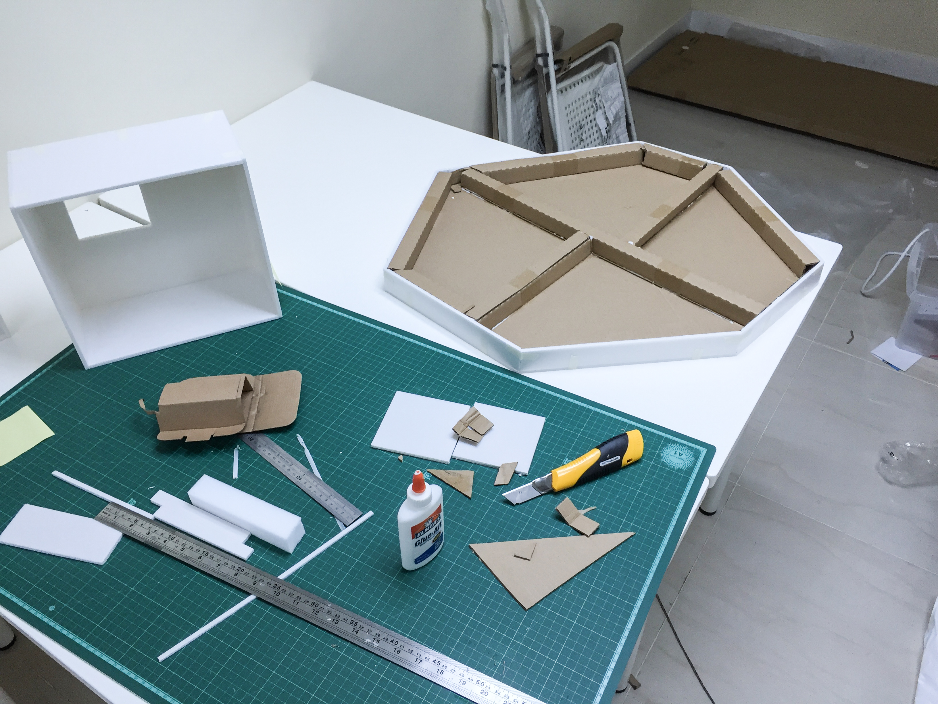
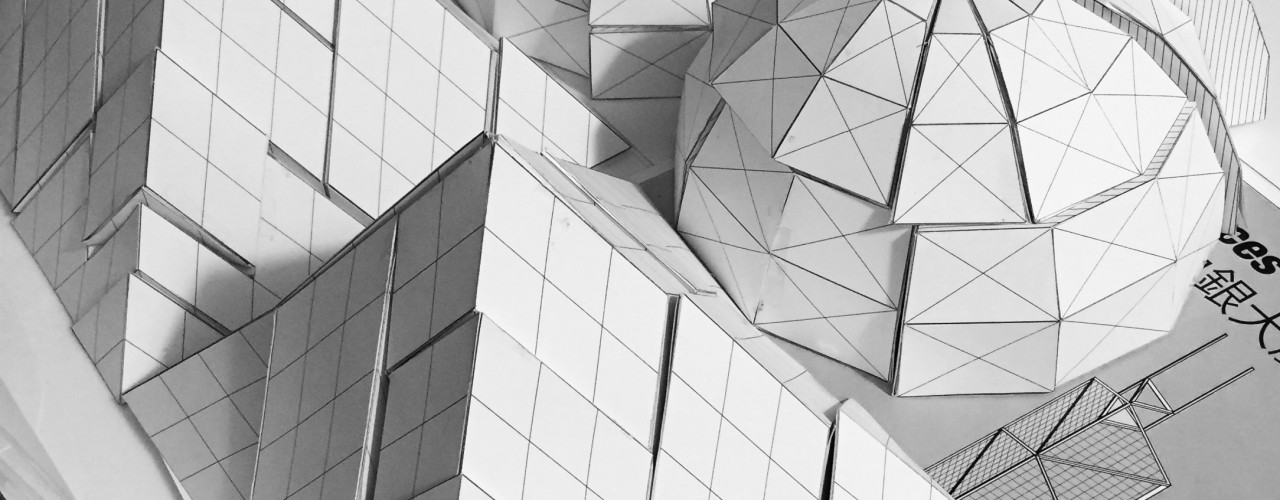
The pentagonal geometry in both section and plan is ideal to explore 3d fabrication technique with SterlingOSB Zero boards. Different joinery systems are required to turn the OSB into different load bearing elements including skylight structure, walls, roofs, and floors. With the aim to reduce construction wastage, the pentagon with faceted surfaces take advantage of the flat OSB. All the exterior portion is covered with metal cladding and glass to provide waterproofing, but the boards are exposed for the interior to create a sense of warmth and rawness. The construction is modular to reduce on-site carbon footprint. Each dwelling unit and skylight will beprefabricated in a factory with CNC machines. The completed module and prefab concrete foundation will be transported to the site for a one-week assembly. With the addition of solar panels and waterless toilets, the project wants to be constructed with minimal impact to the infrastructure and aims to be the off-the-grid.

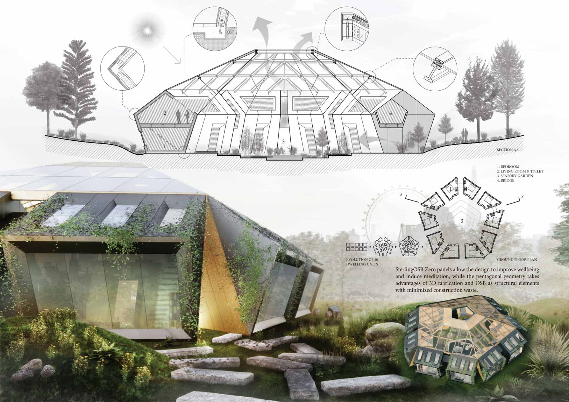
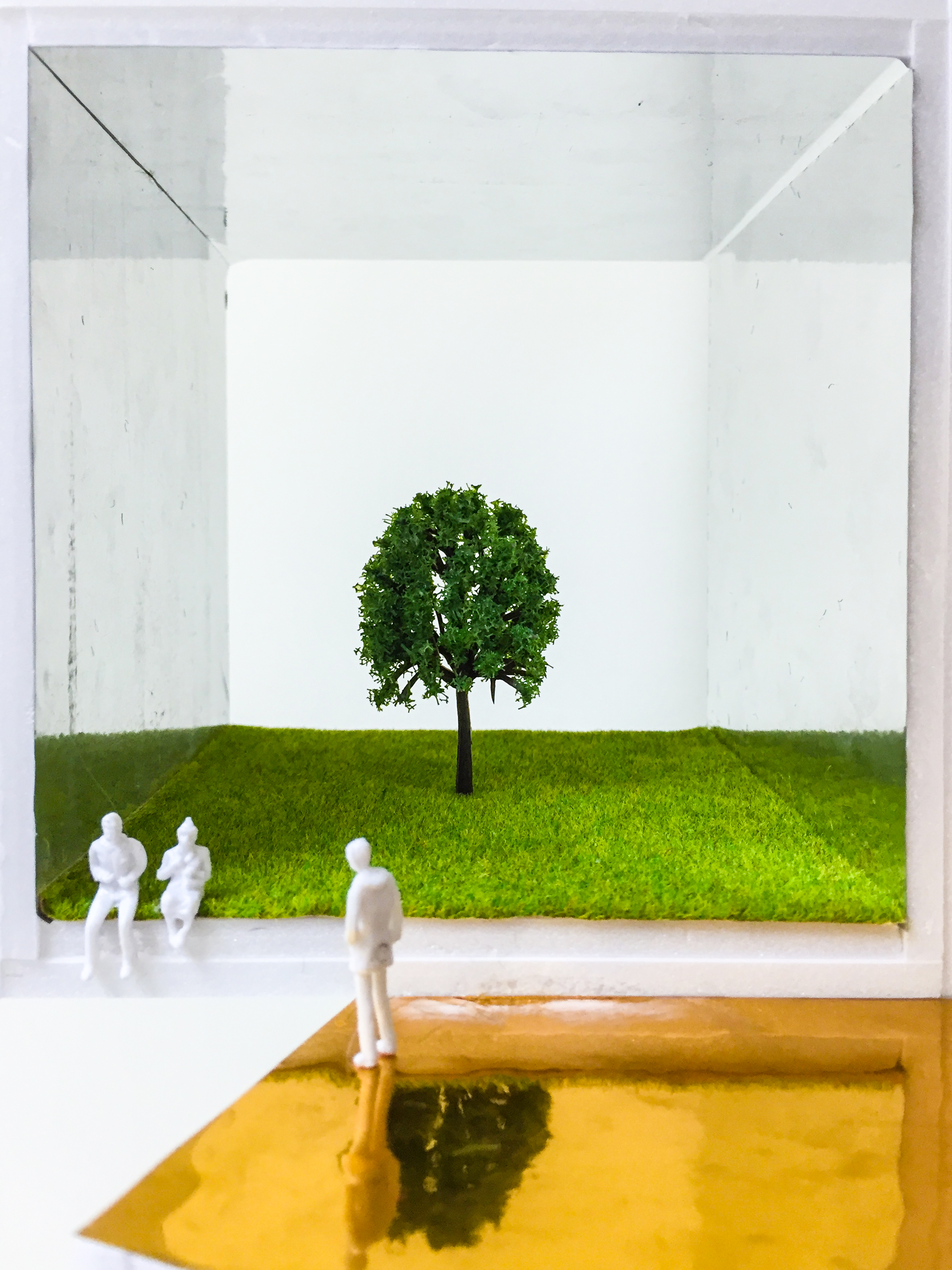
SterlingOSB Zero with zero-added formaldehyde respects the environment, construction worker’s health and occupant’s wellbeing. Its rawness with warm color also adds another layer of rejuvenation to the entire retreat. Ten occupants can choose to isolate in their rooms or interact in the sensory garden and outdoors. The garden can alternatively be accessed directly from the outside or from each dwelling unit. Watching rainwater going through the oculus onto the central pool is both meditative and functional. This distinctive ecosystem will give people an illusion that they have retreated from the city.

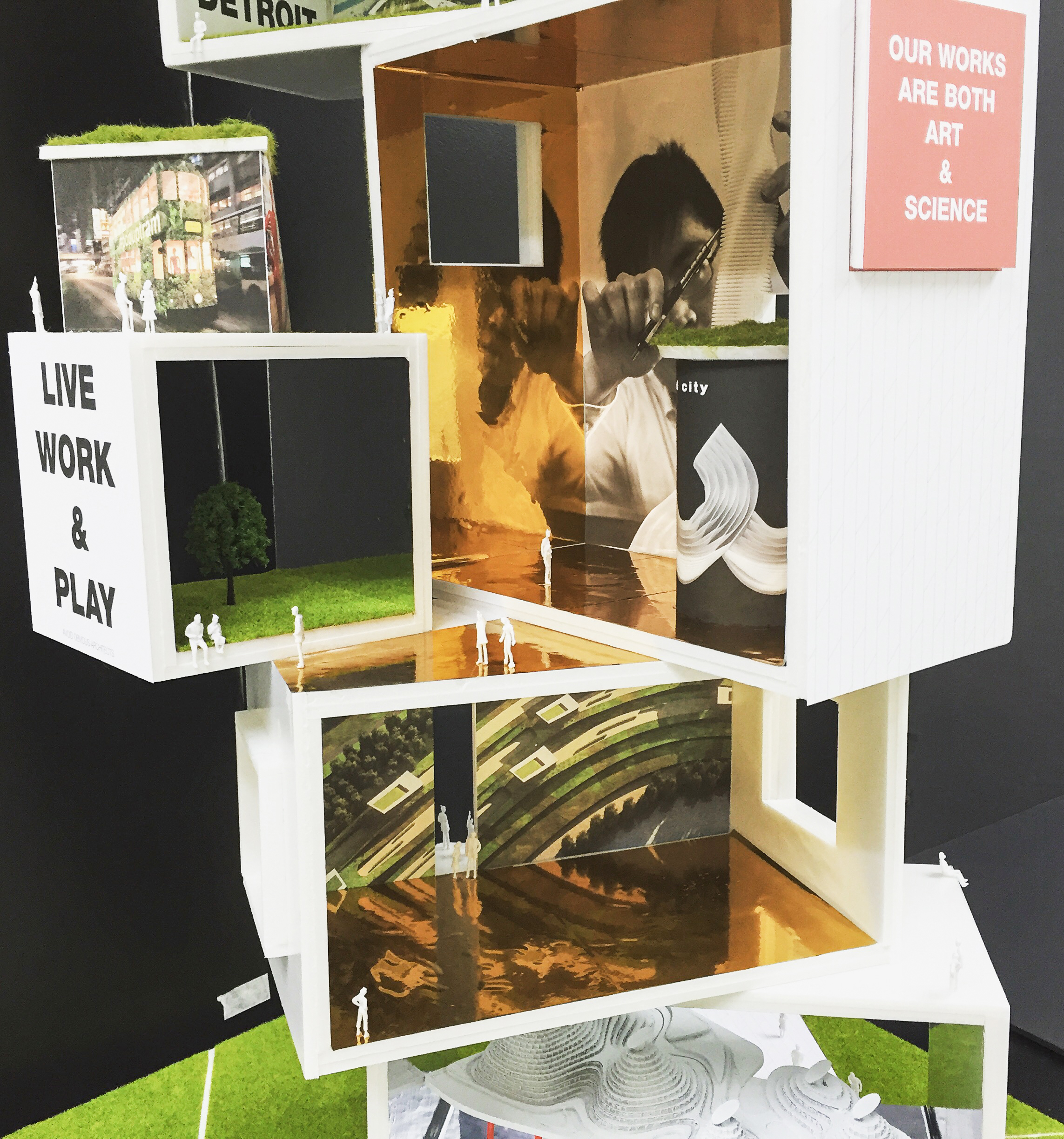
Team: Alvaro Arranz, AIA, Vicky Chan, AIA, Sam Chan, Andy Cheung, Subhiksha Bhoovarahan

Installation, Retail /

Tetris Candy Shop

From Geometry to Candy – Tetris Candy Shop

We helped the Bonbonist to roll out their first concept store in Hong Kong to sell candy. The company plays with geometry from their packaging to their graphics. It is “playful and chic” as the founder put it. The products and branding are like a 3d Tetris Game for adults.  We extended this game-like idea to the candy shop design to include a pixelated wall. The wall itself is almost like a game for people to see and take away their favorite colors. Prior to selecting this pixelated wall geometry, we have tested 20 different forms that are playful, but many of them were not functional. The balance between form and function made this project possible. Many adults and children are attracted by the final color and playfulness.

The candy shop is also modular to allow for relocation. Short-term rental and the idea of mobility is becoming more essential in retail business. Modular design allows for zero waste during relocation and it is probably the most sustainable practice for retailers. Pop-up design is not a trend but a functional response to increased flexibility, sustainability, and ubiquitary.

Concept:

Candy Shop at Full Height:


Candy Shop at half height due to shopping mall’s regulation:

Credit:

Client: The Bonbonist

Design: Emily Manasc, Vicky Chan, Ava Chow

Branding and Graphics: Michele Cade Design

Contractor: M&C Associates

Location: Pacific Place, City Plaza and Harbour City.

See our previous mobile architecture:

Version 1.0: Mobile Shop

Version 2.0: Artist Bike

Version 3.0: PopupTram

Version 4.0: Organic Highway

Version 5.0: Corney & Barrow’s

Version 6.0: The Artist Lab

Version 7.0: La Station Coffee Stop

Version 8.0 Storefront

Version 9.0 The Bonbonist

Installation, Retail /

Color Nude and Its Effect

Color nude and its effect:

We are fascinated by design fully painted in pink and how it can calm people. We did the opposite experiment. What if color nude can excite people? For this pop-up design for AS29, a jewelry shop, we decided to use the diner as a theme and painted the shop in color nude. We wanted to see how the idea of food in color nude can change the perception of jewelry, which is still a luxury item for the general public. From package design to furniture design to logo design, we let the shop share the same nude color. We went as far as painting a sushi conveyor belt to see how people react to nude color in movement. The result is bald, consistent and friendly. Many people got attracted by the color, unexpected theme and movement. The product isalso  more focus because of the consistent backdrop. The work itself become something more than a retail project – it is ART.

Installation, Retail /

Mobile Shop 8.0

storefront, mobile shop, tricycle, avoid obvious, retail, design, architecture, bike, bicycle, flexible, configurable, multiple configurations, detachable, assembly, kit of parts

Mobile Shop 8.0 for Storefront

We designed a mobile shop on tricycle for storefront.

This shop has 5 major pieces that can be attached and detached. By changing the pieces into different locations and positions, shop owners can adapt to various products and their displays.

Below are other design highlights

  1. all pieces are outlined with multi-color lighting to illuminate products
  2. extra storage at the bottom
  3. interchangeable hinge
  4. wheels for all detachable pieces for extra mobility
  5. ipad display
  6. Double swivel glass doors to provide extra display options


 storefront, mobile shop, tricycle, avoid obvious, retail, design, architecture, bike, bicycle, flexible, configurable, multiple configurations, detachable, assembly, kit of parts  storefront, mobile shop, tricycle, avoid obvious, retail, design, architecture, bike, bicycle, flexible, configurable, multiple configurations, detachable, assembly, kit of parts

storefront, mobile shop, tricycle, avoid obvious, retail, design, architecture, bike, bicycle, flexible, configurable, multiple configurations, detachable, assembly, kit of parts

Credit:

Client: Storefront – Benoit Clement Bollee

Team: Emily Manasc, Vicky Chan

Contractor: Han Tang Furniture

See our previous mobile architecture:

Version 1.0: Mobile Shop

Version 2.0: Artist Bike

Version 3.0: PopupTram

Version 4.0: Organic Highway

Version 5.0: Corney & Barrow’s

Version 6.0: The Artist Lab

Version 7.0: La Station Coffee Stop

Version 8.0 Storefront

Version 9.0 The Bonbonist

G107, Bao’an, Shenzhen, masterplan, city planning, sustainable, green, manufacturing, avoid obvious, tetra, architecture, planners, architects, aoarchitect, tetra-arch, connections, drone, highway, future, futuristic, carbon zero, carbon neutral, china, hong kong, pearl river delta, Baoan, autopilot, driverless, high speed, transit, multimodal, connections, sharing economy, co-working, shared, amenities, natural, nature, road, infrastructure, water cycle, water management, landscape, design, branding, engineering, marketing, drone-view, aerial, airporttram, tramways, hong kong, avoid obvious, popup, pop up, mobile architecture, restaurant, shop, runways, interior design, vintage, contextual, old, new, history, preservation, revitalizationpop up shop, beer, chocolate, tricycle, retail. popup, hong kong, vintage, mrtheartist, mobile shop, oldmobile shop, food truck, pop-up, retail

corney & Barrow, wine, mobile, bar, cart, exhibition, wood, sustainable, vintage, world, map, england, merchants, architects, architecture, avoid obvious

Installation /

Mobile Screen

verderbilt, terminal, grand central, new york,, installation, interactive, art, avoid obvious, architects. aoa. vicky chan

Mobile Screen – The Art Performance of a Product

We were tasked to revitalize the space in Vanderbilt Hall at New York Grand Central Terminal. Information display is incredibly important in a terminal. Instead of treating the screen as a static device, we questioned the possibilities of using the screens to define four spaces.

verderbilt, terminal, grand central, new york,, installation, interactive, art, avoid obvious, architects. aoa. vicky chan

verderbilt, terminal, grand central, new york,, installation, interactive, art, avoid obvious, architects. aoa. vicky chan

Spatial Possibilities

There are 9 scenarios to use Vanderbilt Hall when it is idle, for an event or for an art installation.

verderbilt, terminal, grand central, new york,, installation, interactive, art, avoid obvious, architects. aoa. vicky chanverderbilt, terminal, grand central, new york,, installation, interactive, art, avoid obvious, architects. aoa. vicky chanverderbilt, terminal, grand central, new york,, installation, interactive, art, avoid obvious, architects. aoa. vicky chanverderbilt, terminal, grand central, new york,, installation, interactive, art, avoid obvious, architects. aoa. vicky chanverderbilt, terminal, grand central, new york,, installation, interactive, art, avoid obvious, architects. aoa. vicky chan


Installation, Retail /

Mobile Bar 7.0

mobile, bar, cafe, avoid obvious, la station, coffee, module, architecture, train, kit of part, hilton, hotel, vicky chan, architects

Mobile Bar 7.0 – La Station Coffee Stop

La Station is a French Coffee Shop based in Hong Kong. They are testing the pop-up retail with us inside the Hilton Hotel. Below is our concept to use their mobile cafe and the theme of Paris Subway to transform the hotel lobby into a subway station. Each cart will act as a train carts with different repetitive gadgets with multiple functions.

This is our mobile bar 7.0. See previous versions here.

Team: Vicky Chan, Krystal Lung, Ava Chow, Alex Mailloux

mobile, bar, cafe, avoid obvious, la station, coffee, module, architecture, train, kit of part, hilton, hotel, vicky chan, architects

mobile, bar, cafe, avoid obvious, la station, coffee, module, architecture, train, kit of part, hilton, hotel, vicky chan, architects

mobile, bar, cafe, avoid obvious, la station, coffee, module, architecture, train, kit of part, hilton, hotel, vicky chan, architects mobile, bar, cafe, avoid obvious, la station, coffee, module, architecture, train, kit of part, hilton, hotel, vicky chan, architects mobile, bar, cafe, avoid obvious, la station, coffee, module, architecture, train, kit of part, hilton, hotel, vicky chan, architects mobile, bar, cafe, avoid obvious, la station, coffee, module, architecture, train, kit of part, hilton, hotel, vicky chan, architects mobile, bar, cafe, avoid obvious, la station, coffee, module, architecture, train, kit of part, hilton, hotel, vicky chan, architects mobile, bar, cafe, avoid obvious, la station, coffee, module, architecture, train, kit of part, hilton, hotel, vicky chan, architects

Save

Installation, Retail /

Mobile Bar 5.0

corney & Barrow, wine, mobile, bar, cart, exhibition, wood, sustainable, vintage, world, map, england, merchants, architects, architecture, avoid obvious


Mobile Architecture Beta 5.0 – Mobile Bar

We always integrate connectivity, mobility, and sustainability into our building and design.

We were commissioned by Corney & Barrow to expand their Asian presence by building mobile architecture that can move with them to different events. Corney & Barrow is a 230-year-old English wine merchant who sells wine from 12 different countries around the world. Our concept is to recycle their global wooden boxes and stack them together to form a mobile bar. It is about connecting the world to their clients in Asia, while telling people about their 230-year-old history. Corney & Barrow’s Royal Warrants also date back to George V in 1912. A vintage rendition with a Royal touch is the best combination for their brand.

The design concept is not to build one-off items, but an array of brand-related design that can be reused for multiple events. Extending the lifespan of our design is the best way to drive down carbon footprint. At the same time, we have to remain a maximum mobility for their storage and display. The carbon footprint of the bar is further lowered by recycling old wooden materials and bike wheels.

Teams:

Client: Corney & Barrow

Concept and Design: Avoid Obvious Architects

Contractor for Graphics: Prime Work Limited

Contractor for Mobile Bar: Benchmark Design & Exhibition LTD

Concepts:

corney & Barrow, wine, mobile, bar, cart, exhibition, wood, sustainable, vintage, world, map, england, merchants, architects, architecture, avoid obviouscorney & Barrow, wine, mobile, bar, cart, exhibition, wood, sustainable, vintage, world, map, england, merchants, architects, architecture, avoid obviouscorney & Barrow, wine, mobile, bar, cart, exhibition, wood, sustainable, vintage, world, map, england, merchants, architects, architecture, avoid obviouscorney & Barrow, wine, mobile, bar, cart, exhibition, wood, sustainable, vintage, world, map, england, merchants, architects, architecture, avoid obvious

Exhibition in Hong Kong:

corney & Barrow, wine, mobile, bar, cart, exhibition, wood, sustainable, vintage, world, map, england, merchants, architects, architecture, avoid obvious corney & Barrow, wine, mobile, bar, cart, exhibition, wood, sustainable, vintage, world, map, england, merchants, architects, architecture, avoid obvious corney & Barrow, wine, mobile, bar, cart, exhibition, wood, sustainable, vintage, world, map, england, merchants, architects, architecture, avoid obvious corney & Barrow, wine, mobile, bar, cart, exhibition, wood, sustainable, vintage, world, map, england, merchants, architects, architecture, avoid obvious corney & Barrow, wine, mobile, bar, cart, exhibition, wood, sustainable, vintage, world, map, england, merchants, architects, architecture, avoid obvious corney & Barrow, wine, mobile, bar, cart, exhibition, wood, sustainable, vintage, world, map, england, merchants, architects, architecture, avoid obvious corney & Barrow, wine, mobile, bar, cart, exhibition, wood, sustainable, vintage, world, map, england, merchants, architects, architecture, avoid obvious corney & Barrow, wine, mobile, bar, cart, exhibition, wood, sustainable, vintage, world, map, england, merchants, architects, architecture, avoid obvious

See our previous mobile architecture:

Version 1.0: Mobile Shop

Version 2.0: Artist Bike

Version 3.0: PopupTram

Version 4.0: Organic Highway

Version 5.0: Corney & Barrow’s

Version 6.0: The Artist Lab

Version 7.0: La Station Coffee Stop

Version 8.0 Storefront

G107, Bao’an, Shenzhen, masterplan, city planning, sustainable, green, manufacturing, avoid obvious, tetra, architecture, planners, architects, aoarchitect, tetra-arch, connections, drone, highway, future, futuristic, carbon zero, carbon neutral, china, hong kong, pearl river delta, Baoan, autopilot, driverless, high speed, transit, multimodal, connections, sharing economy, co-working, shared, amenities, natural, nature, road, infrastructure, water cycle, water management, landscape, design, branding, engineering, marketing, drone-view, aerial, airporttram, tramways, hong kong, avoid obvious, popup, pop up, mobile architecture, restaurant, shop, runways, interior design, vintage, contextual, old, new, history, preservation, revitalizationpop up shop, beer, chocolate, tricycle, retail. popup, hong kong, vintage, mrtheartist, mobile shop, oldmobile shop, food truck, pop-up, retail

corney & Barrow, wine, mobile, bar, cart, exhibition, wood, sustainable, vintage, world, map, england, merchants, architects, architecture, avoid obvious

Shop + Truck

Canopy and Curtain Open


Save

Save

Save

Save

Save

Save

Save

Save

Save

Save

Save

Save

Installation /

Automated Partitioning System

Automated, Partitioning, Avoid Obvious, Interior Design, Architecture,

Automated Partitioning System

Function

MOD is a automated partitioning system that allows users to dynamically modify environments for their changing needs. MOD is a system of modular screen units throughout the educational space. Each unit is a 5’ by 5’ square and is supported from the ceiling. Lighting is provided for each unit. By adjusting the height and number of screens, MOD allows for social space, meeting space and presentation space. MOD is also connected to an online system. The data of interaction and occupancy will have a live update on the website. Scheduling and space organization is more flexible and controllable.

Inspiration

A system of future education: a flexible space and the educational program has to work together to achieve a better learning environment. MOD is meant to be adaptable for all types of school environment. The fact that MOD is based on a rectangular grid; it can be easily scaled into a small classroom or an entire school. When enough modules are putted together, MOD can become a building by itself. The idea of flexible learning and the types of spaces it generates will offer an array of opportunities and activities for the educators. It helps to resolve problem with private spaces by giving student the option to control the system. Its spatial transformation unleashes the potential of the limited space while encourages more collaboration and interaction. What if MOD becomes a temporary learning center in Central Park during the summer time? MOD will be a spatial experiment to test various teaching paradigm. Teacher can incorporate school-wide game into the process of learning.

Development

First, I use NYU’s ITP floor space as my case study site and continue to develop the idea to different environments and bigger scales. The design process for the physical form begins with a study of geometrical transformation. My intention of the study is to repeat geometrical modules to achieve multiple forms for various functions. I specifically tested simple shape like, square, pentagon, hexagon and rectangle. Each shape was able to generate interesting spatial conditions which allow for better interaction, collaboration and private working spaces. However, a rectangular grid generates the most efficient layout with the best possible outcome. It is also more practical since a rectangular grid also allows original space to re-use furniture or order new off-the-shelves furniture.

Each MOD unit is a 5’ by 5’ square. The system is hung from the ceiling. The major structure consisted of a rectangular aluminum frame with four motorized roll-down screens on the each side of the square. The height and number of screens is controlled by students via an online central system. Depending on the student’s need, MOD allows for social space, meeting space and presentation space. A corresponding rectangular grid of magnet will be inserted between the floor tiles. If the screen is to be lowered to the floor, the magnet can temporarily secure the screen. LED Lighting is also provided for each MOD unit. The goal of the lighting is to create a bigger visual volume during a working configuration, while allowing for darker lighting for presentation or mood lighting for a party. With MOD’s modular system, it can generate various size of space for different activities. The motorized roll-down screens serve as a visual barrier for the zone network system. Users can easily adjust the screens to create different space for their needs.

Team Credit

Avoid Obvious + Hsin Factory

Automated, Partitioning, Avoid Obvious, Interior Design, Architecture,

Automated, Partitioning, Avoid Obvious, Interior Design, Architecture, Automated, Partitioning, Avoid Obvious, Interior Design, Architecture, Automated, Partitioning, Avoid Obvious, Interior Design, Architecture,

Installation, Urban Planning /

Flag Plaza

Flags, International, Avoid Obvious, UN, United Nations, Olypmics, Plaza, Benches, 2d, 3d, wood, wave, sustainable, architecture, furniture

World Countries Flags > International Flag Plaza

We are always interested in bridging the gap between graphics and architecture. The idea of International Flag Plaza is to give a spatial and democratic identity to all countries flags.

Those flags on poles are always seen in Olympics Games or UN conferences, but the setting doesn’t leave visitor much impression or reading of each country. Graphics from the top of a flag pole is also not a democratic approach to tell people what each country is about.

Flags, International, Avoid Obvious, UN, United Nations, Olypmics, Plaza, Benches, 2d, 3d, wood, wave, sustainable, architecture, furniture

It will be more educational and democratic to replace those flags on high poles with physical furniture made in the shape of a flag. People can sit on different flag benches as they read and learn something about the countries.

Design of most country flags are geometrical. Those shapes and pattern already carries a lot of meanings and history. Turning a 2d flag into a 3d bench are inherently contextual. The entire plaza made up of 288 or more flags are also designed as one waving international flag. The end result is a dynamic and inviting plaza that carries the history of the world.

Flags, International, Avoid Obvious, UN, United Nations, Olypmics, Plaza, Benches, 2d, 3d, wood, wave, sustainable, architecture, furniture Flags, International, Avoid Obvious, UN, United Nations, Olypmics, Plaza, Benches, 2d, 3d, wood, wave, sustainable, architecture, furniture Flags, International, Avoid Obvious, UN, United Nations, Olypmics, Plaza, Benches, 2d, 3d, wood, wave, sustainable, architecture, furnitureFlags, International, Avoid Obvious, UN, United Nations, Olypmics, Plaza, Benches, 2d, 3d, wood, wave, sustainable, architecture, furniture Flags, International, Avoid Obvious, UN, United Nations, Olypmics, Plaza, Benches, 2d, 3d, wood, wave, sustainable, architecture, furniture Flags, International, Avoid Obvious, UN, United Nations, Olypmics, Plaza, Benches, 2d, 3d, wood, wave, sustainable, architecture, furniture


Graphics, Installation /

TextMoss

greenwall, green, vertical, planting, platns, moss, text, 3d, greenscape, landscape, triangle fire, boardway, NYU, brown building, avoid obvious

TextMOSS – Text can grows

The idea of this TextMoss is to use plant material to symbolize the event of Triangle Fire and the ongoing struggle for working class. The memorial subtlety integrates itself to the Brown building, but the use of material makes it visually unique from the surrounding context. Wouldn’t it be nice to represent a tragic event using plants that are organic, useful and lively? All the victims name are formed as moss and lined up on the stone wall.

The second part of this memorial is a row of Holly trees at the rooftop of the Brown building. They serve as the soft counterpart to the solid moss wall at the bottom. Holly tree also has the symbolism of protection, overcoming of anger, spiritual warrior. They represent those lives lost in the fire but the evergreen quality helps the memorial to bring a positive message out of a tragic event.

Both pieces from top and bottom of the building work together to give the Brown Building a new identity. The plant materials not only serve several symbolism, but they will very likely help the building to reduce its carbon footprint. This memorial is symbolically and functionally meaningful.

Check out our related greenwall ideas: golfscape and tramways

greenwall, green, vertical, planting, platns, moss, text, 3d, greenscape, landscape, triangle fire, boardway, NYU, brown building, avoid obvious

greenwall, green, vertical, planting, platns, moss, text, 3d, greenscape, landscape, triangle fire, boardway, NYU, brown building, avoid obvious

With a little bit of water, moss can last for a month.

greenwall, green, vertical, planting, platns, moss, text, 3d, greenscape, landscape, triangle fire, boardway, NYU, brown building, avoid obvious

Duration Test

greenwall, green, vertical, planting, platns, moss, text, 3d, greenscape, landscape, triangle fire, boardway, NYU, brown building, avoid obvious greenwall, green, vertical, planting, platns, moss, text, 3d, greenscape, landscape, triangle fire, boardway, NYU, brown building, avoid obvious


Installation /

AO Museum

model making, avoid obvious, green, sustainable, architect, architecture, museum, recycled, green

AO Museum

AO Museum is our experimental model to combine all of our projects into one project. The idea is inspired by our previous AO sandwich. Can projects repeat itself to new project? Can ideas like materials be recycled and turned into a new idea?

Our work plays with our sustainable ideas. It has our ideas about live, work and play. Each gallery is offset and stacked on top of on another. Green roof and outdoor gallery are created. The use of reflective surface also helps to create a different dimension without the gallery. It is a whimsical model that stays true to our core belief. The material used to make this model are 85% recycled material. They were cardboard and foam board we found in the trash. We practice what we preach about sustainable design. Models included in this AO Museum are Smart City, Wind City, Flow Villa and Popup Tramways.


model making, avoid obvious, green, sustainable, architect, architecture, museum, recycled, green

model making, avoid obvious, green, sustainable, architect, architecture, museum, recycled, green model making, avoid obvious, green, sustainable, architect, architecture, museum, recycled, green

model making, avoid obvious, green, sustainable, architect, architecture, museum, recycled, green

Courtyard

model making, avoid obvious, green, sustainable, architect, architecture, museum, recycled, green model making, avoid obvious, green, sustainable, architect, architecture, museum, recycled, green


model making, avoid obvious, green, sustainable, architect, architecture, museum, recycled, green

entry canopy

Commercial, Installation /

OLED Turbine

Wind turbine, flow, sculpture, green, sustainable, razor, gillete, boston, competition, winner, product, design, architecture, spiral, twisted, avoid obvious, OLED, Advestising, Commerical

OLED Turbine :: Aliasing

Aliasing is an array of wind turbines that uses OLED technology as the blades. The result is a sustainable billboard powered by wind.

Each OLED panel is stacked on top of each other to form a spiral which serves as a vertical axis wind turbine to provide energy for information display. During the windy day, ALIASING will provide viewers with ever-changing patterns. It is a billboard sculpture that captures both the dynamics of wind and viewer’s attention. At night, the lit OLED panels are highly visible. It displays information just like a regular screen but with a special aliasing effect.

ALIASING is a dynamic sculpture even when it is static. The degree of rotation between two OLED panels controls the pre-defined aliasing patterns. With proper control of transparency, each pattern can be a wonderful light diffuser and sculpture. ALIASING can be installed without electricity generators in an interior space to provide partition and mood lighting. It can also be installed with electricity generators on a building façade to provide unique architectural identify.

Wind turbine, flow, sculpture, green, sustainable, razor, gillete, boston, competition, winner, product, design, architecture, spiral, twisted, avoid obvious, OLED, Advestising, Commerical


Wind turbine, flow, sculpture, green, sustainable, razor, gillete, boston, competition, winner, product, design, architecture, spiral, twisted, avoid obvious, OLED, Advestising, Commerical Wind turbine, flow, sculpture, green, sustainable, razor, gillete, boston, competition, winner, product, design, architecture, spiral, twisted, avoid obvious, OLED, Advestising, Commerical Wind turbine, flow, sculpture, green, sustainable, razor, gillete, boston, competition, winner, product, design, architecture, spiral, twisted, avoid obvious, OLED, Advestising, Commerical


Wind turbine, flow, sculpture, green, sustainable, razor, gillete, boston, competition, winner, product, design, architecture, spiral, twisted, avoid obvious, OLED, Advestising, Commerical

Installation /

Gillette – Razor Turbine

Wind turbine, flow, sculpture, green, sustainable, razor, gillete, boston, competition, winner, product, design, architecture, spiral, twisted, avoid obvious

Awarded: Gillette Landmark Design Competition 3rd place.

FLOW is two vertical-axis wind turbines that combine the history of P&G Gillette with environmental goal of 21st century.

The form and configuration of FLOW is inspired by Gillette’s Safety Razor patented in 1904. Both turbines have nine mini sets of blades. Each blade retains the proportion of Gillette’s Razor, as if the blade is constantly shaving the sky. Two FLOW turbines are placed at different elevations to allow for intersection in plan, while keeping the footprint within the specified site.

This combination of vibrant colors and spatial configuration creates a rich palette of double spiral patterns. These patterns will be constantly animated throughout the year by various wind intensity. The silhouette of FLOW forms a dynamic spine that can reinforce the curved façade of the newly designed building, while creates a harmonious contrast with different orthogonal elements found in the existing campus. This idea of using natural energy to power an art piece establish a good example for other industries in South Boston community.

See our design for OLED Turbine known as Aliasing.

Wind turbine, flow, sculpture, green, sustainable, razor, gillete, boston, competition, winner, product, design, architecture, spiral, twisted, avoid obvious Wind turbine, flow, sculpture, green, sustainable, razor, gillete, boston, competition, winner, product, design, architecture, spiral, twisted, avoid obvious

Installation, Urban Planning /

International Flag Bench

craftwsmanship, wooden bench, 3d bench, waved bench, 2d to 3d. cnc, Architecture, Avoid obvious

2d to 3d: International Flag as Benches

We are always interested in bridging the gap between 2d graphics and 3d architecture. We did it with type and mask previously and this time we explore the potential from a flag’s graphic. The idea is to find spatial quality within a 2d graphics. From a first glance, design of most country flags are geometrical. Those shapes and pattern already carries a lot of meanings and history. The 3d geometry are inherently contextual. It was an easy task to depend the geometry. To carry the concept of a flag to a 3d level, we decided to make the top surface of a bench in a wave form. The stripes and stars are turned into different extrusions and cutout. The end result is a fun and inviting bench that carries the history of its country.

To celebrate Independence Day in the US, we did the first prototype with an American Flag. The final goal is to apply the idea to all the flags and created an international plaza with these international flag benches.


Image from WIkipedia

Image from WIkipedia

craftwsmanship, wooden bench, 3d bench, waved bench, 2d to 3d. cnc, Architecture, Avoid obvious

Drawing


craftwsmanship, wooden bench, 3d bench, waved bench, 2d to 3d. cnc, Architecture, Avoid obvious

American Flag Bench

General, Installation, Urban Planning /

Hong Kong as a Stage

umbrella movement, occupy central, occupy, protest, hong kong, drama, play, stage

Turning a historical event into a performance?

After seeing the Umbrella Movement in Hong Kong late in 2014, we as architects thinks that it will be very interesting to turn the event into a theatrical performance. We can narrate a political movement with actions and graphics. It will help to raise more questions and discussion about the future of Hong Kong in a more entertaining way. Below is a series of set designs that describe the movement in chronological order. The graphic details borrow a lot of symbols used during the movement. Although this set describes one specific protest to demand universal suffrage, but it essentially explores the idea of identify, law and urban planning.

Country and Home

How do people in Hong Kong deal with the identity of being Chinese?

umbrella movement, occupy central, occupy, protest, hong kong, drama, play, stage

Country Vs. Home

Wall and Egg

How do people in Hong Kong deal with the rules setup by China?

umbrella movement, occupy central, occupy, protest, hong kong, drama, play, stage

Wall Vs. Egg

Law and Crime

What is the boundary between violating a law and committing a crime?

umbrella movement, occupy central, occupy, protest, hong kong, drama, play, stage

Law Vs. Crime

City and Village

Is living in a village better than the city?

umbrella movement, occupy central, occupy, protest, hong kong, drama, play, stage

City Vs. Village

Installation, teaching /

Buildings as 3D Puzzles

3d puzzle, children game, paper puzzle, la salle primary school, architecture, 3d toy

Magnetic Puzzles:

We setup a booth with 3D puzzle challenge at La Salle Primary School Spring Festival. To make the event fun and challenging, we designed and built three sets of 3D puzzle based on three landmark buildings. There are three difficulty levels. Students could win prizes if they could assemble the puzzles within certain time limits. Bank of China is level 1 with 6 parts to assemble. Space museum is level 2 with 12 pieces and Louvre is also 12 pieces at Level 3. Children was having fun while learning about history of the buildings and their geometries. They learn how to identify and build 3d puzzle by recognizing similar 3d patterns. We also get to see how different children react to complicated forms. Some understands the 3D relationship immediately, but some have hard time even with two basic pieces. Some of the children and parents enjoyed the game so much. They came back to challenge multiple times. Our booth was placed third in the competition among all other booth designs in the Festival.

This is actually third time we created educational toys for children. The first project was Magnestic Play which was done at New York Hall of Science. The second one is Big Book with New York University. Both Projects were collaborated with Hsin Factory. We are a big believer of Jane McGonigal said about gaming. She gave a TED talk and said it is possible to solve the real world problems by playing more games. Of course, she was referring to intelligent games with realistic issues. Our toy on the other hands are inspiring children in a micro scale. We do believe those toys will slowly let children to understand the concepts of efficient structure and sustainable designs. When they grow up, they will solve real world issues in creative ways.

Special Thanks to Edmund Chung from La Salle Primary School and Parent Association who helped us to organize the Spring Festival.

-Vicky Chan, Architect and Educator


Installation, Urban Planning /

Green Mong Kok in South Africa

Micro Galleries, Open Streets Langa, Hong Kong, Occupy Movement, Mong Kok, Urban Planning, Flying Cars, cross ventilation, solar panels, green mall, park, urban landscape, umbrella revolution, 佔中,佔旺佔領行動行動

Turning streets into gallery:

Micro Galleries turned streets in Langa, Cape Town into a gallery. Their mission is to “change the world in small and creative ways”.

Our work on Green Mong Kok and Documentation of the Umbrella Movement is featured in their show with Open Streets Langa. We are very excited and humbled that our creation of a local drawing and a local movement are now international. Special thanks to Kat Roma Greer from Micro Galleries who organized this event and all the photos below. The interaction between people and art is what made the event meaningful and successful. The idea is very similar to why we teach architecture to young children in Hong Kong. Our agenda is to influence the future leaders with creative thinking. I do believe this exhibition gave people in Cape Town a different idea about “art” and “freedom of speech”.

Kat Roma Greer was in Langa to organize the exhibition with her team. After the event, Kat said to the team”…Old guys were walking down the lane shaking our hands and saying thank you for doing this. It was so shocking and surprising and humbling. I heard endless conversations about the umbrella revolution, saw tonnes of people colouring, reading poems about sunflowers, looking at each detailed image of HK, laughing at space baby, pointing at political cartoons – even on small kid saying in halting English ‘freedom of speech’ reading a work from Sletch Freedom, amazing at the beauty and scale of the European forest. Amazing. Someone asked me about Australian politic and refugee centres, someone else asked how you can create via google images. It was just astounding.”

The idea of turning unused public spaces into exhibition spaces is a fantastic urban planning idea. Micro Galleries previously did it in Wan Chai and Tai Hang in 2013. There are so many public spaces in Hong Kong that can be turned into art projects, like hill that people used to hang clothes and the dark streets in Soho. I can’t wait to find more local spaces in Hong Kong and turn them into meaningful projects.

-Vicky Chan, Artist and Architect

Hong Kong, Occupy Movement, Mong Kok, Urban Planning, Flying Cars, cross ventilation, solar panels, green mall, park, urban landscape, umbrella revolution, 佔中,佔旺佔領行動行動

Artwork by Vicky Chan; Photo by Kat Roma Greer


Hong Kong, Occupy Movement, Mong Kok, Urban Planning, Flying Cars, cross ventilation, solar panels, green mall, park, urban landscape, umbrella revolution, 佔中,佔旺佔領行動行動

Artwork by Vicky Chan; Photo by Kat Roma Greer


Hong Kong, Occupy Movement, Mong Kok, Urban Planning, Flying Cars, cross ventilation, solar panels, green mall, park, urban landscape, umbrella revolution, 佔中,佔旺佔領行動行動

Artwork by Vicky Chan; Photo by Kat Roma Greer


Micro Galleries, Open Streets Langa, Hong Kong, Occupy Movement, Mong Kok, Urban Planning, Flying Cars, cross ventilation, solar panels, green mall, park, urban landscape, umbrella revolution, 佔中,佔旺佔領行動行動

Artwork by Vicky Chan; Photo by Kat Roma Greer


Arts related to Hong Kong by other artists. Photo credit: Kat Roma Greer from Micro Galleries


Installation /

Straws Canopy

Straws Canopy

We volunteered to help LaSalle Primary School with their Spring Festival. There were two parts to the event. One was to build a booth with limited budget and two was to design a game that children can play to learn about architecture. For the booth, we designed and built a curved canopy out of straws. Straw is a material that children are familiar with and they are also very cheap to get. We got 1000 straws for only 6 USD and we also recycled them after the event. Our booth was placed third in the design competition.

See our architecture for children program and mission.

Volunteer Team:

Vicky Chan (Architect)

Horus Wan (Software Engineer)

Edmund Chung (Teacher from LaSalle Primary School)


Straw Canopy, School project, kid school project, children construction, architecture for children

Straw Canopy at Night


Straw Canopy, School project, kid school project, children construction, architecture for children

Straw Canopy at night


Straw Canopy, School project, kid school project, children construction, architecture for children

Straw Canopy at night